Controls
PyXBMCt provides 9 ready-to-use UI controls that are based on the respective xbmcgui controls
with the following differences:
You don’t need to specify coordinates and size for the controls explicitly. The Grid layout manager takes care of control placement.
All controls that require textures are provided with default textures (borrowed from Confluence and Estuary skin resources). You can specify your own textures for PyXBMCt controls, but you need to do this through keyword arguments (important!).
Button caption is center-aligned by default. You can change button caption alignment by providing a necessary alignment parameter through a keyword argument (PyXBMCt already includes symbolic constants for control text alignment). Since all PyXBMCt Controls are subclassed from
xbmcgui.Control*classes, you can use all parentxbmcguiclasses’ methods to set Control properties.
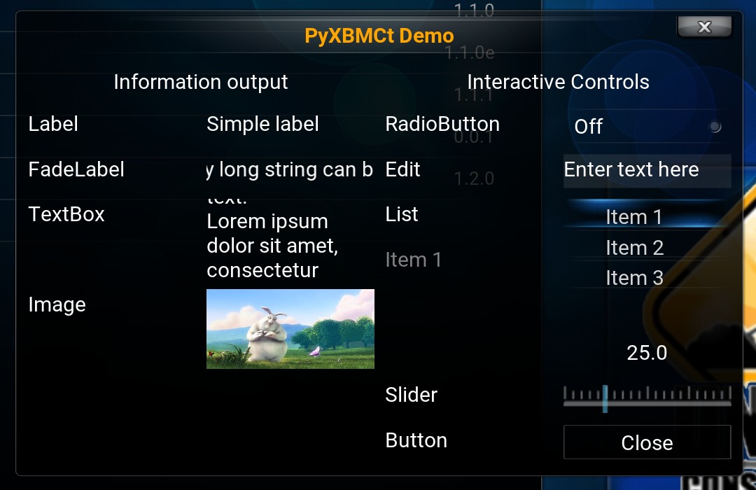
PyXBMCt controls (Confluence-based skin)
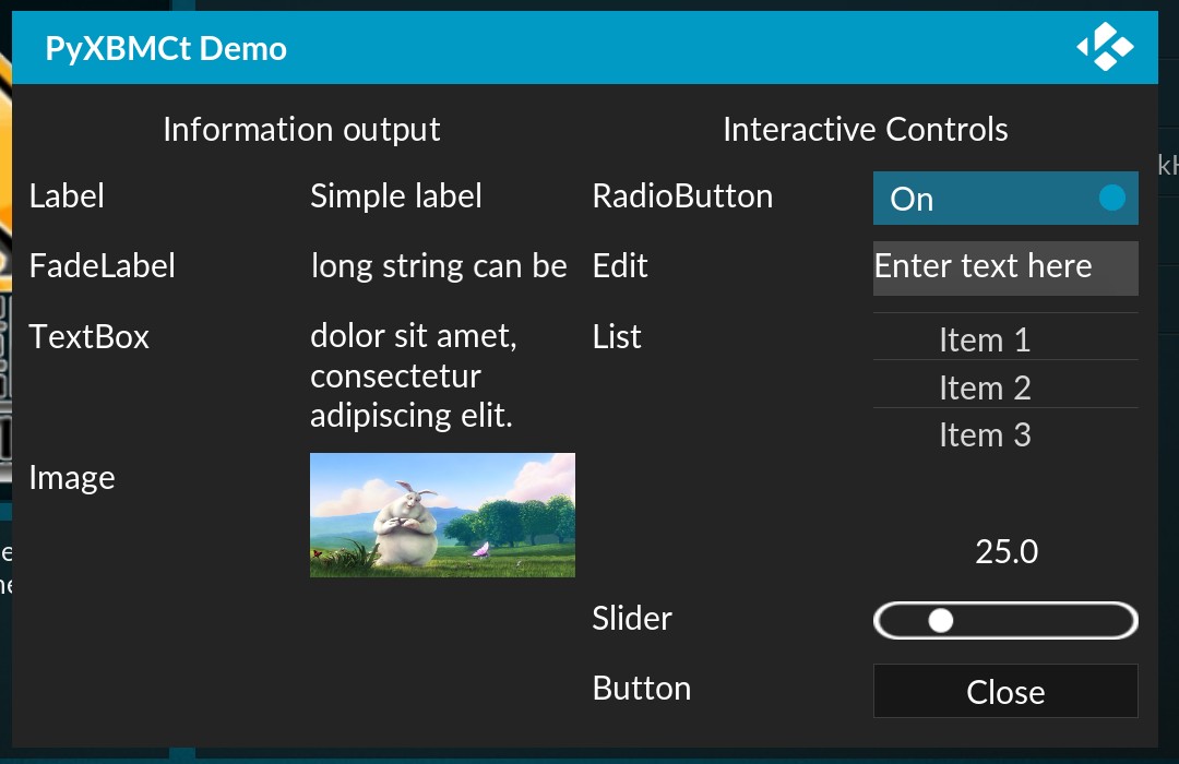
PyXBMCt controls (Estuary-based skin)
Below is the list of PyXBMCt controls with brief descriptions:
Label
Label implements a simple text label much like Tkinter.Label or QLabel.
FadeLabel
FaldeLabel is similar to Label,
but a very long text string is auto-scrolled.
TextBox
TextBox shows multiline text. It can autoscroll very long text.
Image
Image control displays images from files (.jpg, .png, .gif).
For .gif and .png images transparency is supported, and for .gif animation is shown as well.
Edit
Edit implements a text entry field, similar to Tkinter.Entry or QLineEdit.
When activated, it opens an on-screen keyboard to enter text.
List
List implements a list of items.
The list scrolls when it cannot display all its items within available space.
It generates a control event when an item is selected.
Slider
Slider is a control for stepless adjusting some value (e.g. volume level).
